The chart 93% of Unlabeled players missed
Unlabeled has been live for about a week now, and there's finally enough play data to start seeing which charts cause people the most trouble. This chart on figure skating has been presented the greatest challenge so far.
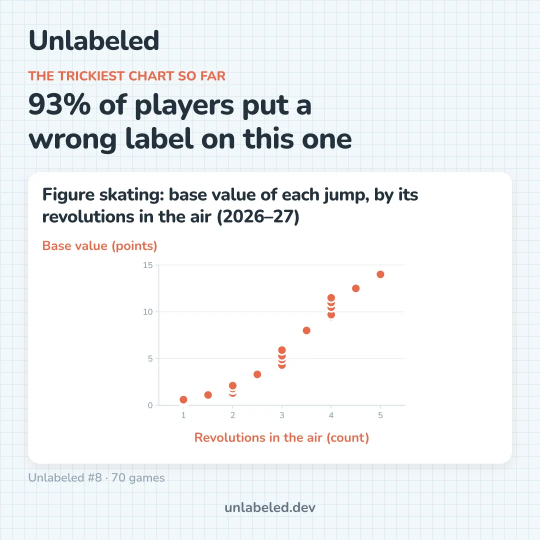
93% of solvers put at least one wrong label on this chart, which doesn't look terribly hard at first glance. It's a scatter plot that climbs like a step function from left to right, with small clusters stacked at the whole number intervals. But that's sort of the problem. The property where "a thing goes up as other thing goes up" describes a huge number of datasets, and the decoy labels in each puzzle are chosen to be plausible candidates.
The giveaways are subtle (and perhaps require a bit of figure skating domain knowledge that I suspect is rare). There are dots at the half-steps, representing the axel, the only jump that takes off going forward, so there is an extra half rotation. The clusters at 2, 3 and 4 are the different jump types at the same rotation count, each bringing the skater a slightly different score. If you follow this sport, it is probably obvious after a few seconds looking at the chart and the potential labels. In Unlabeled, each puzzle has usually at most one 'hard' chart, and what makes it hard is the subject matter being well known by a very small percentage of people.
The timing question
This got me thinking about something I hadn't really considered when designing the game: how might the challenge posed by a chart change based on when the puzzle is played?
If this puzzle had run in February during the Milan Cortina Winter Olympics, I suspect that 93% would have been lower. Millions of people who typically don't think about figure skating probably watched a bit of it for this event, listening to commentators explain why this jump carries more weight than another, and listening to the quad axel get talked about as the hardest jump in the sport (I remember hearing this several times, and I only watched a small portion of figure skating coverage). "Revolutions in the air" would have been taking up some portion of brain space, however temporarily, during that time.
I think I want to lean into this a bit when designing future puzzles. Some ideas:
- Scheduling topical charts around the time of the events they're about, so people paying attention are rewarded while solving the puzzle
- Analysis to see where difficulty is coming from, whether it's the chart content or the puzzle overall
It's still super early, and I admittedly don't have a ton of players. The figure skating chart's puzzle was only solved ~70 times, and there will be a lot of selection effects and noise in such a small group of players, but as puzzles are solved by more people, I think they will represent a lot of low-hanging interesting experiments and analysis.
Thanks for reading, and come try out an Unlabeled puzzle!